Population Discrimination with Wavelets
Víctor Manuel Tuset & Antoni Lombarte
2025-11-27
Source:vignettes/Working_Wavelets.Rmd
Working_Wavelets.RmdAbout this tutorial
This tutorial provides step-by-step guide for comparing the otolith contours. The accompanying code is only an example to facilitate morphological understanding of the analyses. Same protocol for stock separation.
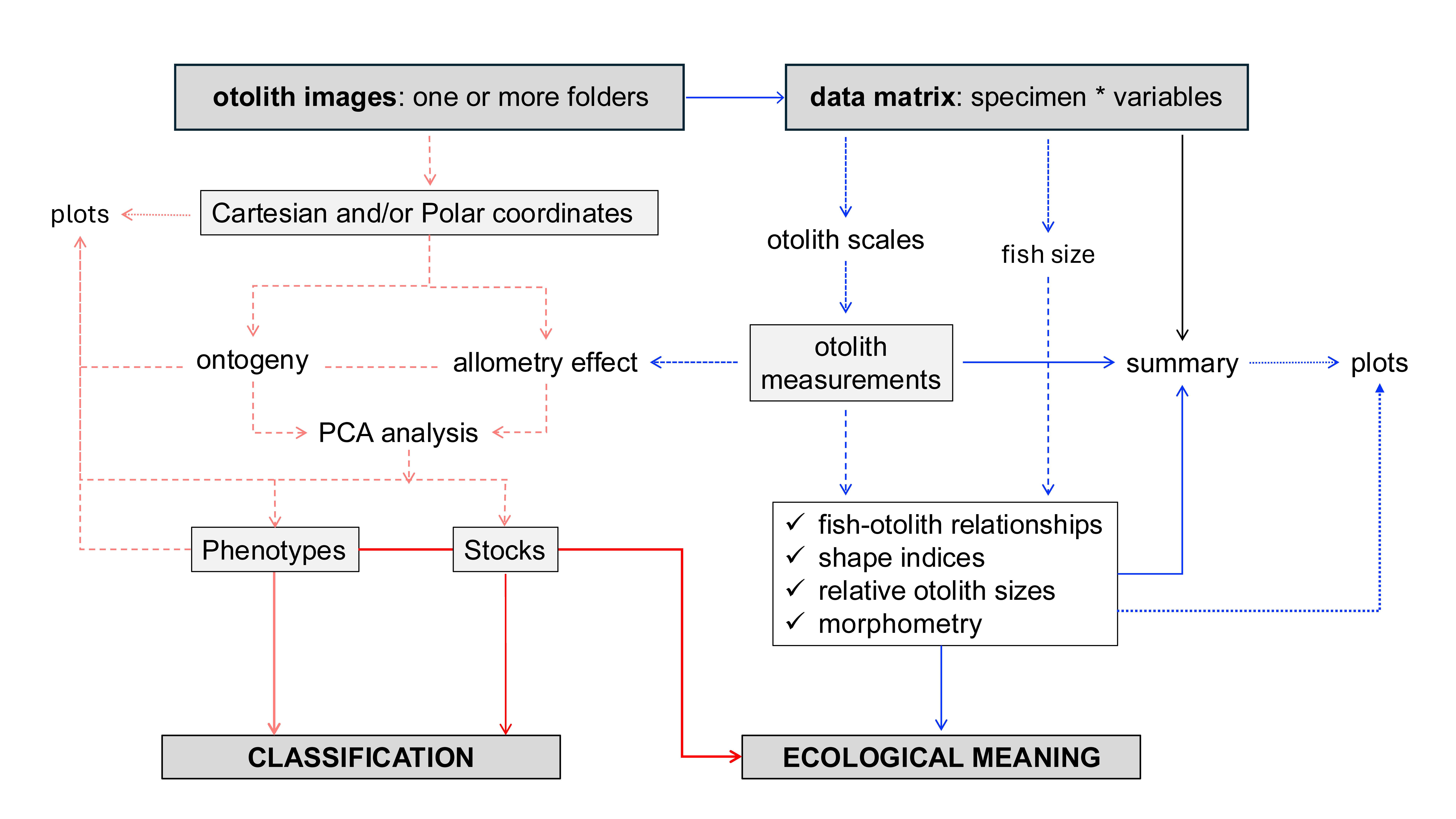
1. Summarizing
Users can find a summary of the analytic procedure in Vasconcelos et al. (2025). Follow this tutorial for a step-by-step guide to the main framework, shown in the flowchart below:
2. Building dataset
The code is exemplified using two phylogenetically close species, Aphanopus carbo and Aphanopus intermedius.
Merging wavelet at 5th and biological and morphological data.
# Load libraries
library(aforoR)
library(dplyr)

# Step 1: Load the built-in datasets
# Aphanopus_W5 contains wavelet coefficients at scale 5
# Aphanopus contains morphometric and biological data
data(Aphanopus_W5)
data(Aphanopus)

# Step 2: Clean IDs (remove .jpg or .tif extensions for consistent joining)
Aphanopus_W5$ID <- gsub("\\.(jpg|tif)$", "", Aphanopus_W5$ID)
Aphanopus$ID <- gsub("\\.(jpg|tif)$", "", Aphanopus$ID)

# Step 3: Combine datasets using a left join
# This merges wavelet coefficients with morphometrics and biological data
Aphanopus_full <- Aphanopus_W5 %>%
  left_join(Aphanopus, by = c("ID", "Species"))

# Step 4: Check structure
str(Aphanopus_full) # Should now contain W1..W512, SL, Area, etc.
3. Wavelet analysis
3.1. Generating wavelet plot
The mean and standard deviation wavelets by species.
## Step 1: Obtain the mean and sd by species
meanAphanopusM<-aggregate(Aphanopus_full[, 3:514], list(Aphanopus_full$Species), mean)
meanAphanopusSD<-aggregate(Aphanopus_full[, 3:514], list(Aphanopus_full$Species), sd)

# Step 2: Transforming data
meanAphanopusM<-as.data.frame(t(meanAphanopusM))
meanAphanopusSD<-as.data.frame(t(meanAphanopusSD))

meanAphanopusM<-meanAphanopusM[-(1),]
meanAphanopusSD<-meanAphanopusSD[-(1),]
colnames(meanAphanopusM)[1]<-"AcarM"
colnames(meanAphanopusM)[2]<-"AintM"
colnames(meanAphanopusSD)[1]<-"AcarSD"
colnames(meanAphanopusSD)[2]<-"AintSD"
str(meanAphanopusM)
str(meanAphanopusSD)

meanAphanopusM$AcarM<-as.numeric(as.character(meanAphanopusM$AcarM))
meanAphanopusM$AintM<-as.numeric(as.character(meanAphanopusM$AintM))
meanAphanopusSD$AcarSD<-as.numeric(as.character(meanAphanopusSD$AcarSD))
meanAphanopusSD$AintSD<-as.numeric(as.character(meanAphanopusSD$AintSD))
str(meanAphanopusM)
str(meanAphanopusSD)

meanAphanopus<-cbind(meanAphanopusM, meanAphanopusSD)
meanAphanopus$PSDAcar<-meanAphanopusM$AcarM+meanAphanopusSD$AcarSD
meanAphanopus$NSDAcar<-meanAphanopusM$AcarM-meanAphanopusSD$AcarSD
meanAphanopus$PSDAint<-meanAphanopusM$AintM+meanAphanopusSD$AintSD
meanAphanopus$NSDAint<-meanAphanopusM$AintM-meanAphanopusSD$AintSD
col<-c(1:512)
meanAphanopus2<-cbind(meanAphanopus, col)
str(meanAphanopus2)

library(gridExtra)
library(ggplot2)
ggplot(meanAphanopus2, aes(x = col)) +
  # --- A. carbo ---
  geom_line(aes(y = AcarM, colour = "A. carbo"), size = 0.5) +
  geom_line(aes(y = PSDAcar), colour = "dodgerblue", linetype = "dotted", size = 0.25) +
  geom_line(aes(y = NSDAcar), colour = "dodgerblue", linetype = "dotted", size = 0.25) +
  geom_ribbon(aes(ymin = pmin(PSDAcar, NSDAcar),
                  ymax = pmax(PSDAcar, NSDAcar)),
              fill = "lightcyan2", alpha = 0.4) +

  # --- A. intermedius ---
  geom_line(aes(y = AintM, colour = "A. intermedius"), size = 0.5) +
  geom_line(aes(y = PSDAint), colour = "darkorange", linetype = "dotted", size = 0.25) +
  geom_line(aes(y = NSDAint), colour = "darkorange", linetype = "dotted", size = 0.25) +
  geom_ribbon(aes(ymin = pmin(PSDAint, NSDAint),
                  ymax = pmax(PSDAint, NSDAint)),
              fill = "peachpuff", alpha = 0.4) +

  # --- Axes, colors, and theme ---
  scale_colour_manual(values = c("A. carbo" = "blue", "A. intermedius" = "coral2")) +
  labs(
    title = "Aphanopus spp.",
    x = "Points",
    y = "Normalized Distance",
  ) +
  ylim(-0.04, 0.06) +
  theme_minimal(base_size = 12) +
  theme(
    legend.position = c(0.9, 0.1),
    legend.title = element_blank(),
    legend.text = element_text(size = 8),
    plot.title = element_text(size = 12, face = "bold", hjust = 0.5),
    axis.title = element_text(size = 10),
    axis.text = element_text(size = 8, color = "black"),
    panel.grid.minor = element_blank(),
    panel.grid.major = element_blank(),
    axis.line = element_line(color = "black", linewidth = 0.3),
    axis.ticks = element_line(color = "black", linewidth = 0.3),  # ← adds tick marks
    axis.ticks.length = unit(0.15, "cm"),
)") This plot provides preliminary
morphological insights into population variability between species. High
overlap reflects comparable morphologies, whereas regions where the mean
values and their deviations do not overlap may reveal significant
interspecific differences.
This plot provides preliminary
morphological insights into population variability between species. High
overlap reflects comparable morphologies, whereas regions where the mean
values and their deviations do not overlap may reveal significant
interspecific differences.
3.2. PCA analysis
The next step is to reduce the information from wavelet function using principal components analysis.
# Load libraries
library(stats)
library(factoextra)

# Step 1: PCA analysis to reduce the whole information
PCA<-prcomp(Aphanopus_full[, 3:514])
summary(PCA)
fviz_eig(PCA)

Importance of components:
                          PC1     PC2     PC3     PC4     PC5     PC6     PC7     PC8
Standard deviation     0.1073 0.09782 0.05876 0.04684 0.04350 0.03480 0.03124 0.03054
Proportion of Variance 0.3150 0.26197 0.09452 0.06006 0.05181 0.03315 0.02672 0.02553
Cumulative Proportion  0.3150 0.57702 0.67154 0.73159 0.78340 0.81655 0.84327 0.86880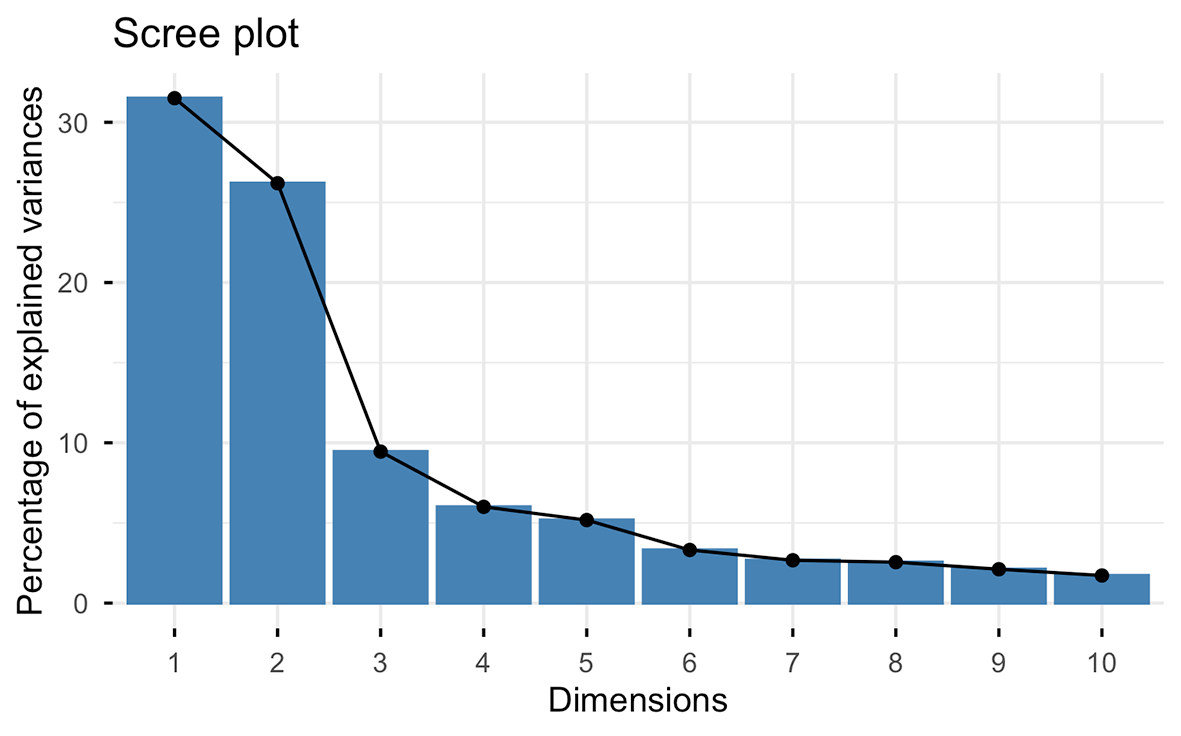
Several criteria can be applied to determine the number of components to use for subsequent analysis. We usually apply the Broken stick model (MacArthur, 1957).
# Step 2:plot de Broken Stick model.
ev<-PCA$sdev^2
ev
evplot = function(ev) {
  n = length(ev)
  bsm = data.frame(j=seq(1:n), p=0)
  bsm$p[1] = 1/n
  for (i in 2:n) bsm$p[i] = bsm$p[i-1] + (1/(n + 1 - i))
  bsm$p = 100*bsm$p/n
  # Plot eigenvalues and % of variation for each axis
  op = par(mfrow=c(2,1),omi=c(0.1,0.3,0.1,0.1), mar=c(1, 1, 1, 1))
  barplot(ev, main="Eigenvalues", col="bisque", las=2)
  abline(h=mean(ev), col="red")
  legend("topright", "Average eigenvalue", lwd=1, col=2, bty="n")
  barplot(t(cbind(100*ev/sum(ev), bsm$p[n:1])), beside=TRUE,
          main="% variation", col=c("bisque",2), las=2)
  legend("topright", c("% eigenvalue", "Broken stick model"),
         pch=15, col=c("bisque",2), bty="n")
  par(op)
}
evplot(ev)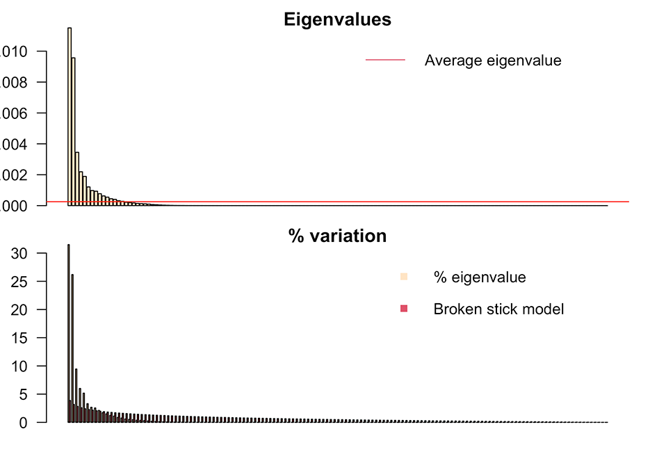
The first nine components are retained, accounting for 89% of the variance. The subsequent step involves removing the size effect and generate the PCA plot. Use otolith length versus fish length whenever possible.
# Step 3: To determine if PCA components are affected for otolith length, try no use fish length.
PCA_new<-data.frame(PCA$x[,1:9])
str(PCA_new)
DataT<-as.data.frame(cbind(PCA_new, Aphanopus_full$Species, Aphanopus_full$OL))
colnames(DataT)[10]<-"Species"
colnames(DataT)[11]<-"OL"
DataT$Species<-as.factor(DataT$Species)
str(DataT)
# Step 4: Loop through each PCA component (X) and test for significant correlation regression with OL (Y)
# Initialize an empty data frame with the same number of rows
new_df <- data.frame(matrix(ncol = 0, nrow = nrow(DataT)))

# Loop through the first 9 PCA components
for (i in 1:9) {

  # Current PC name
  pc_name <- colnames(DataT)[i]

  # Perform Spearman correlation test (suppress warning about ties)
  cor_test_result <- suppressWarnings(cor.test(DataT[[pc_name]], DataT$OL, method = "spearman"))

  # Check significance
  if (cor_test_result$p.value < 0.05) {
    # Handle missing values explicitly
    valid_rows <- complete.cases(DataT[[pc_name]], DataT$OL)

    # Fit model only on valid rows
    model <- lm(DataT[[pc_name]][valid_rows] ~ DataT$OL[valid_rows])

    # Initialize full residuals vector with NA
    residuals_data <- rep(NA, nrow(DataT))

    # Fill in residuals where data were valid
    residuals_data[valid_rows] <- residuals(model)

    # Add to new dataframe
    new_df[[pc_name]] <- residuals_data

  } else {
    # Not significant → keep original PC
    new_df[[pc_name]] <- DataT[[pc_name]]
  }
}

# Ensure columns remain in PC1–PC9 order
new_df <- new_df[, colnames(DataT)[1:9]]

# Preview
head(new_df)
          PC1         PC2          PC3          PC4         PC5          PC6          PC7
1 -0.07060664 -0.17302690  0.056376553 -0.099267522  0.01416037 -0.015354115  0.017413276
2  0.10800827 -0.03404682  0.006684351  0.002701855 -0.04659298 -0.024297950 -0.057687406
3  0.03855501 -0.14398936  0.029570762 -0.003582640 -0.04576928  0.080875709  0.008970799
4  0.04325765 -0.11812447 -0.036406453  0.043416069  0.01659939 -0.004591727 -0.027105931
5  0.14657106 -0.04405241  0.023244592  0.055384963 -0.02007291 -0.053424561  0.022594244
6  0.07678577 -0.13817150  0.062860916 -0.015142196  0.02617368  0.026061831 -0.022331642

# Step 5: Combine PC components with factor (Species or Stocks)
DataT1<-as.data.frame(cbind(new_df, Aphanopus_full$Species))
colnames(DataT1)[10]<-"Species"
rownames(DataT1)<-Aphanopus_full$ID
str(DataT1)
###### Plot PC1-PC2 including the coord images of farthest individuals each 30 degrees
# Load libraries
library(grid)
library(png)

# Step 1: Compute distance and angles
angles_deg <- seq(0, 330, by = 30)

DataT1 <- DataT1 %>%
  mutate(
    distance = sqrt(PC1^2 + PC2^2),
    angle = atan2(PC2, PC1) * 180 / pi
  )
DataT1$angle[DataT1$angle < 0] <- DataT1$angle[DataT1$angle < 0] + 360

# Step 2: Select the farthest point in each 30° sector
window <- 15
farthest_points <- do.call(rbind, lapply(angles_deg, function(theta) {
  in_sector <- abs((DataT1$angle - theta + 180) %% 360 - 180) <= window
  if (any(in_sector)) {
    sector <- DataT1[in_sector, ]
    sector[which.max(sector$distance), c("ID", "PC1", "PC2")]
  }
})) %>% mutate(angle_sector = angles_deg)

# Step 3: Base PCA scatter plot
xlim <- range(DataT1$PC1)
ylim <- range(DataT1$PC2)
x_center <- mean(xlim)
y_center <- mean(ylim)
radius_x <- diff(xlim)/2
radius_y <- diff(ylim)/2
outer_radius <- 1.05  # outside the PCA frame

p <- ggplot(DataT1, aes(PC1, PC2, color = Species, shape = Species)) +
  geom_point(alpha = 0.8, size = 3) +  # colored points
  scale_shape_manual(values = c(1,2)) +
  scale_color_manual(values= c("blue","coral2")) +
  coord_cartesian(xlim = c(-0.3, 0.4), ylim = c(-0.4, 0.3)) +
  geom_hline(yintercept = 0, linetype = "dashed", color = "gray80") +
  geom_vline(xintercept = 0, linetype = "dashed", color = "gray80") +
  labs(x = "PC1", y = "PC2") +
  theme_minimal(base_size = 12) +
  theme(
    panel.grid = element_blank(),       # eliminate grid
    panel.border = element_rect(color = "black"),     # no frame
    legend.position = "bottom",
    legend.title = element_blank(),
    axis.line = element_line(color = "black"),  # Add line for 0-axis
    axis.ticks.length = unit(0.15, "cm"),
    axis.ticks = element_line(color = "black")
  )

# Step 4: Add mini-plots outside PCA frame
size_x <- diff(xlim) * 0.35
size_y <- diff(ylim) * 0.35

for (i in 1:nrow(farthest_points)) {
  fp <- farthest_points[i, ]
  img_file <- paste0("Plots_IDs/", fp$ID, ".png")

  if (file.exists(img_file)) {
    img <- readPNG(img_file)
    img_grob <- rasterGrob(img)

    # compute position outside frame
    theta <- fp$angle_sector * pi / 180
    x_img <- x_center + cos(theta) * radius_x * outer_radius*1.1
    y_img <- y_center + sin(theta) * radius_y * outer_radius*1.1
    # add mini plot
    p <- p + annotation_custom(
      img_grob,
      xmin = x_img - size_x/2, xmax = x_img + size_x/2,
      ymin = y_img - size_y/2, ymax = y_img + size_y/2
    )
  }
}

# Step 5: Display plot
print(p)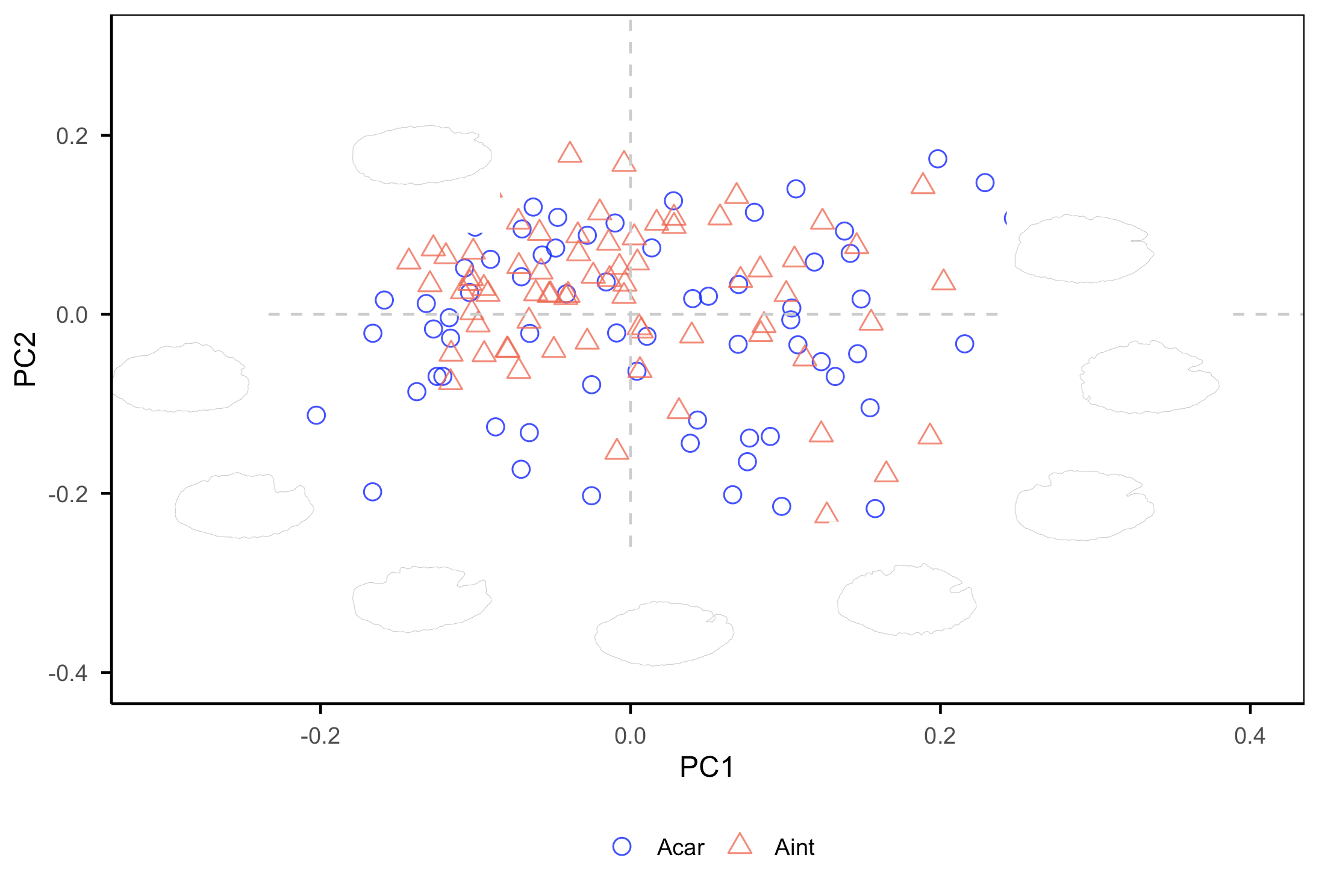
The PC1 axis differentiates otoliths with a more oval posterior margin (positive values) from those with more angular shapes (negative values). The PC2 axis separates otoliths with a deeper notch between the rostrum and antirostrum (negative values) from otoliths without a notch (positive values). A greater number of shapes located below the x-axis indicates higher morphological variability.
3.3. PERMANOVA test
Using the PC’s components.
PERMANOVA<-adonis2(DataT1[, 1:9] ~ DataT1$Species, permutations = 9999, method = "manhattan")

PERMANOVA
Permutation test for adonis under reduced model
Terms added sequentially (first to last)
Permutation: free
Number of permutations: 9999

adonis2(formula = DataT1[, 1:9] ~ DataT1$Species, permutations = 9999, method = "manhattan")
                Df SumOfSqs     R2      F Pr(>F)
DataT1$Species   1   0.5911 0.0261 3.7789 0.0024 **
Residual       141  22.0553 0.9739
Total          142  22.6464 1.0000
---
Signif. codes:  0 ‘***’ 0.001 ‘**’ 0.01 ‘*’ 0.05 ‘.’ 0.1 ‘ ’ 1
Results indicate significant differences in the otolith shapes between species (F=3779, p= 0024).
3.4. Classifying
There are many options (supervised and not-supervised) methods and packages. See specific tutorials for “caret” package, for example, https://rpubs.com/tibaredha/tibaredha.
Important:
For the limited genetic sample size (<150 individuals per species), we recommend a Leave-One-Out Cross-Validation (LOOCV) approach, repeating 1,000 times per analysis to ensure robust classification accuracy and model evaluation (Martí-Puig et al., 2019). Training and testing options only when the sample is bigger.
to check in detail tunegrid function.
preProcess=c(“center”,“scale”). The PC1–PC2 plot offers a first look at shape variation and possible overlap. However, the most informative differences may lie in PCs with low explained variance, and this visualization (with this argument) helps to emphasize their role in distinguishing species or stocks.
Example using MLP (Multi-layer Perceptron classifier), a supervised learning algorithm, with LOOCV.
library(caret)
set.seed(10000001)
tunegridT <- expand.grid(size = c(30, 40, 50, 60, 70, 75, 80))# depends classifier
CntrlT <- trainControl(method="LOOCV", number = 1000)
ModelMLP<-train(Species~PC1+PC2+PC3+PC4+PC5+PC6+PC7+PC8+PC9,
              data=DataT1,
              method = "mlp",
              trControl=CntrlT,#specify the cross validation using trControl
              preProcess = c("center","scale"),
              learnFunc = "Std_Backpropagation",
              tuneGrid=tunegridT,
              maxit=100)
print(ModelMLP)

# Multi-Layer Perceptron
  143 samples
  9 predictor
  2 classes: Acar, Aint

Pre-processing: centered (9), scaled (9)
Resampling: Leave-One-Out Cross-Validation
Summary of sample sizes: 142, 142, 142, 142, 142, 142, ...
Resampling results across tuning parameters:

  size  Accuracy   Kappa
  30    0.6223776  0.2447183
  40    0.6853147  0.3704139
  50    0.6643357  0.3287698
  60    0.6643357  0.3289011
  70    0.6363636  0.2726917
  75    0.6153846  0.2311076
  80    0.6503497  0.3005283

Accuracy was used to select the optimal model using the largest value.
The final value used for the model was size = 40.

ggplot(ModelMLP)# To test if tunegrid is right
Predict <- predict(ModelMLP, newdata=DataT1)
confusionMatrix(Predict, DataT1$Species)

# Confusion Matrix and Statistics

          Reference
Prediction Acar Aint
      Acar   64    4
      Aint    7   68

               Accuracy : 0.9231
                 95% CI : (0.8665, 0.961)
    No Information Rate : 0.5035
    P-Value [Acc > NIR] : <2e-16

                  Kappa : 0.8461

   Mcnemar Test P-Value : 0.5465

            Sensitivity : 0.9014
            Specificity : 0.9444
         Pos Pred Value : 0.9412
         Neg Pred Value : 0.9067
             Prevalence : 0.4965
         Detection Rate : 0.4476
   Detection Prevalence : 0.4755
      Balanced Accuracy : 0.9229

         Positive Class : Acar

varImp(ModelMLP)# Provides information on relevance of PC components in the classification

# ROC curve variable importance
    Importance
PC3    100.000
PC4     51.609
PC2     47.153
PC6     35.272
PC5     31.436
PC9     21.535
PC8      8.045
PC1      4.703
PC7      0.000
Example with training and testing sets:
set.seed(1000000)
inTrainS <- createDataPartition(y = DataT1$Species, p = 0.75, list = F)
trainingS <- DataT1[ inTrainS,]
testingS  <- DataT1[-inTrainS,]
table(trainingS$Species)
table(testingS$Species)

#MLP classifier
set.seed(10000001)
tunegridTS <- expand.grid(size = c(200, 210, 220, 230, 240, 250, 260, 270, 280, 300))
CntrlTS <- trainControl(method= "repeatedcv", repeats=100,
                       number = 4)
ModelMLP<-train(Species~PC1+PC2+PC3+PC4+PC5+PC6+PC7+PC8+PC9,
              data=DataT1,
              method = "mlp",
              trControl=CntrlT,#specify the cross validation using trControl
              preProcess = c("center","scale"),
              learnFunc = "Std_Backpropagation",
              tuneGrid=tunegridT,
              maxit=100)
#Results above
After determining the PCs that contribute most to group discrimination, correlations with the wavelet function can be calculated to locate the specific regions of variation.
#### Create a plot to identify the morphological differences between species
library(ggpubr)
library(ggplot2)
library(dplyr)
library(tidyr)
PCVIS<-as.matrix(DataT1[,1:9])
PCVIS2<-as.matrix(Aphanopus_full[, 3:514])
PCVIS3<-cor(PCVIS,PCVIS2)
PCVIS4<-data.frame(t(PCVIS3))
PCVIS4<-cbind(col, PCVIS4)

# Step 1: Create a wavelet mean
Wavelet_mean <- data.frame(
  col = 1:512,  # adjust if different
  value = colMeans(Aphanopus_full[, 3:514])
)

# Step 2: Select the PCs you want
PC_data <- PCVIS4 %>%
  select(col, PC3, PC4, PC2, PC6) %>%
  pivot_longer(cols = starts_with("PC"),
               names_to = "PC",
               values_to = "value") %>%
  mutate(PC = factor(PC, levels = c("PC3", "PC4", "PC2", "PC6")))

# Step 3: Compute a common scaling factor for secondary axis
scale_factor <- max(PC_data$value, na.rm = TRUE) / max(Wavelet_mean$value, na.rm = TRUE)

# Step 4: Define threshold for high correlation
threshold_low <- -0.5
threshold_high <- 0.5
PC_data <- PC_data %>%
  mutate(bar_fill = ifelse(value < threshold_low | value > threshold_high, "high", "low"))

# Step 5: Create plot
ggplot() +
  geom_bar(
    data = PC_data,
    aes(x = col, y = value, fill = bar_fill),
    stat = "identity", width = 0.25
  ) +
  geom_line(
    data = Wavelet_mean,
    aes(x = col, y = value * scale_factor),
    color = "blue", linewidth = 0.5
  ) +
  facet_wrap(~PC, ncol = 2, scales = "free_y") +
  scale_fill_manual(values = c("low" = "grey", "high" = "black")) +
  scale_y_continuous(
    name = "Correlation",
    sec.axis = sec_axis(~ . / scale_factor, name = "Wavelet mean")
  ) +
  theme_classic() +
  theme(
    strip.text = element_text(face = "bold", size = 9),
    strip.background = element_rect(fill="lightyellow", linewidth = 0.2),
    axis.title.x = element_blank(),
    axis.text.x = element_text(size = 9),
    axis.text.y = element_text(size = 9),
    axis.title = element_text(face = "bold", size = 10),
    legend.position = "none",
    panel.spacing = unit(0.5, "lines"),
    axis.line = element_line(linewidth = 0.2),
    axis.ticks = element_line(linewidth = 0.2),
    axis.ticks.length = unit(0.1, "cm")
  )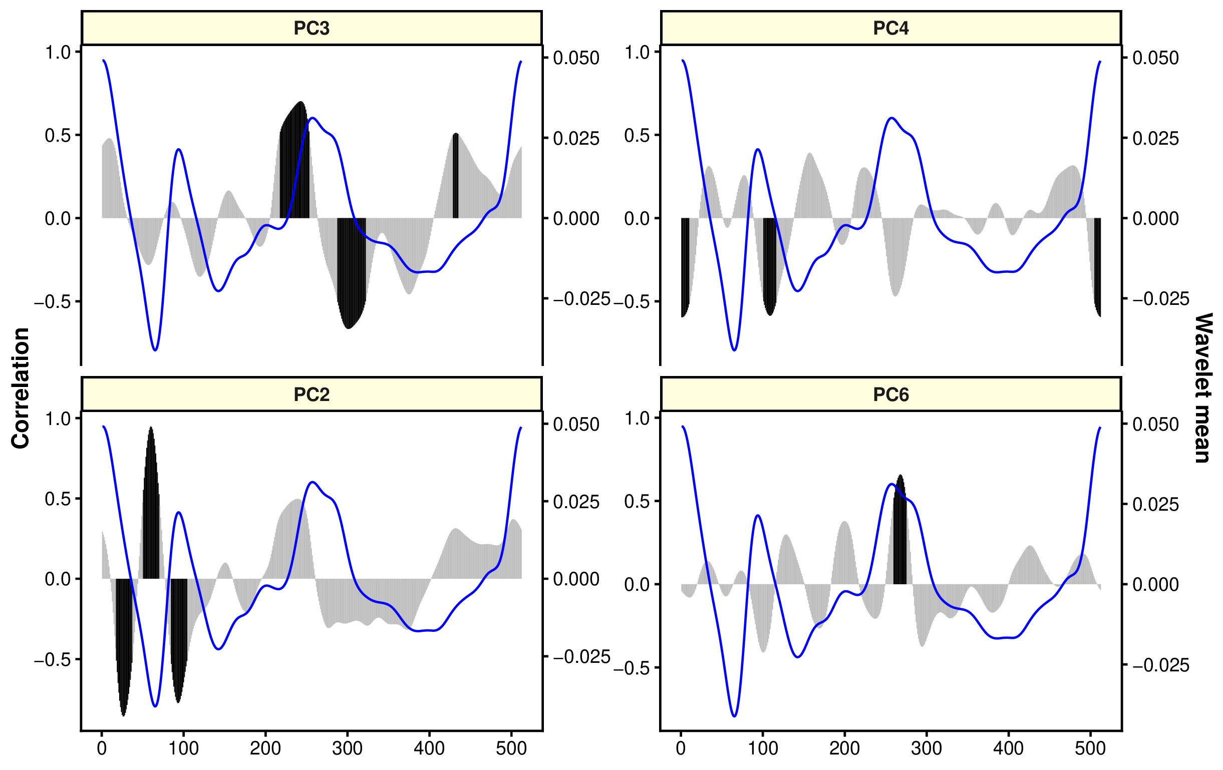
The black bars show the regions more correlated to PC components, which is linked to discrimination of groups. In this case, rostrum and antirostrum region and posterior region are relevant to separate both species (similar results that in the figure of wavelets).